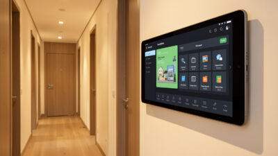
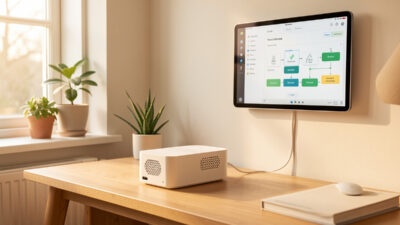
Home Assistant Conditional Cards: Show Controls When They Matter
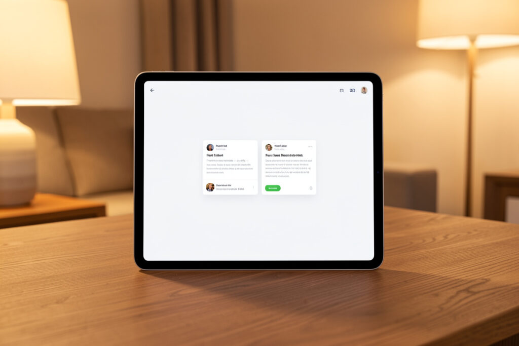
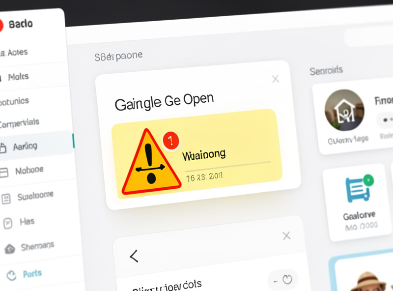
The difference between a dashboard you glance at and one you have to read is conditional cards. A conditional card shows a control or a warning only when it is actually relevant — the garage-open alert appears when the garage is open and vanishes when it shuts. In my setup this single technique is what keeps a busy house dashboard calm: the everyday view stays uncluttered, and the things that need attention surface themselves exactly when they matter.
Home Assistant gives you two ways to do this now, and it is worth knowing both. The older one is the dedicated conditional card, a wrapper that shows its contents only when a condition is met. The newer one is the visibility option built into every card, so you can attach a condition to any card without wrapping it. I use the built-in visibility conditions for most things today and reach for the conditional card wrapper when I want to show a whole group at once. This is the technique that turns the layout ideas in my dashboard design guide into a screen that feels alive.
The Problem Conditional Cards Solve
A dashboard that shows every possible control at all times is exhausting. You end up scanning past twelve things that are fine to find the one that is not. Worse, static warning cards train people to ignore them — if the “garage” card is always there, nobody notices when it actually means the garage is open at midnight. Attention is the scarce resource on a dashboard, and showing everything all the time spends it badly.
Conditional visibility flips that. A card that only appears when something is wrong, or when a control is genuinely useful right now, carries real signal. When the “windows open” card shows up, it means windows are open — every time, no false positives to tune out. That reliability is what makes people trust and use the dashboard instead of reaching for their phone.
Two Ways to Make a Card Conditional
The conditional card is a container: you give it one or more conditions and a set of cards to show when those conditions are true. The conditional card documentation shows the exact YAML for the wrapper. It is perfect when you want to reveal a whole block at once — say a full “someone is at the door” panel with the camera snapshot, the unlock button, and the intercom, all appearing together when the doorbell motion fires.
The visibility condition is newer and lives inside every card’s own configuration, on a Visibility tab in the editor. You attach the condition directly to the card, no wrapper needed. The card configuration docs list every condition type available on that Visibility tab. For a single card this is cleaner, and it works in the visual editor without touching YAML. My rule: visibility conditions for one-off cards, the conditional card wrapper when I want to gate a group. Both evaluate the same kinds of conditions, so it is purely about how many cards you are hiding at once.
The Conditions Worth Knowing
Conditions come in a few flavors, and mixing them is where the power is. A state condition shows a card when an entity is in a given state — cover is open, alarm is armed, person is home. A numeric condition shows a card above or below a threshold — humidity over 70%, battery under 20%, temperature below 18. A screen condition shows a card only on certain screen sizes, which is how one dashboard can adapt between a phone and a wall tablet. And you can combine conditions with and/or logic so a card appears only when several things are true at once.
That combination is where real recipes come from. “Show the AC control card only when it is summer and someone is home and the indoor temperature is above 24” is three conditions joined together, and the card simply is not there the rest of the year. The dashboard adapts to the season, the occupancy, and the state of the house without you ever touching it.
The Recipes I Actually Run
These are the conditional cards that live on my dashboards, and they are a good starter set to copy:
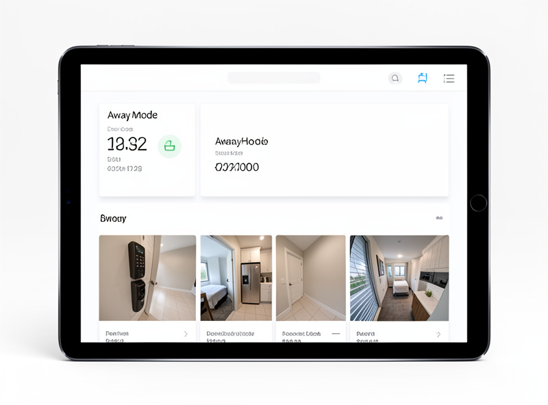
A windows-open card that lists any open window and hides itself when everything is shut — instant answer to “did I leave one open?” A laundry-done card that appears when the washer finishes (energy monitoring tells the hub the cycle ended) and clears when acknowledged. An away-mode panel that swaps in when the house is empty, showing the lock status, the cameras, and an arm-security button while hiding the everyday room controls nobody needs while out. A low-battery card that only shows up when something actually needs a battery. And a guest-mode toggle that reveals a simplified set of controls for visitors and hides the admin bits.
A couple more that earn their keep: a media-playing card that only shows transport controls when something is actually playing, so the living-room view is clean when the TV is off; a weather-warning card that appears when rain or frost is forecast and hides on clear days; and a door-unlocked reminder that surfaces if the smart lock has been open for more than a few minutes. Each one is a single condition or two, and each one removes a permanent piece of clutter in exchange for a card that means something when you see it.
Notice the pattern: every one of these hides in the calm state and appears in the exception state. That is the whole design philosophy. Your dashboard should be nearly empty when everything is normal, and populate itself with exactly the relevant controls when something changes. It is the opposite of the default everything-at-once view, and it is what makes a screen feel intelligent rather than busy.
Writing Your First Conditional Card
The fastest way to learn this is to build one on a card you already have. Pick something with a clear on/off state — a garage door, a specific window contact, the washing machine. In the dashboard editor, open that card, find the Visibility tab, and add a state condition: entity is the garage cover, state is “open.” Save it, then open and close the garage. The card appears and disappears in real time. That single loop teaches the whole concept better than any amount of reading.
From there you layer. Add a second condition to the same card — say, only show it after 9pm — and now you have a “garage left open at night” card that ignores daytime comings and goings. The conditions are joined with AND by default, so every one has to be true. If you want OR logic, or more than two conditions, that is where dropping into the YAML editor for that card gives you the full expressiveness, but you can get surprisingly far in the visual editor alone.
A useful habit while building: temporarily set the condition to always-true so you can see and style the card, get it looking right, then switch the real condition back on. Otherwise you are trying to design a card that keeps vanishing on you. Build it visible, then make it conditional last.
Conditional Cards Versus Automations
A fair question is why not just use an automation to send a notification instead of a conditional card. The answer is that they do different jobs and pair well. An automation pushes a message to your phone — good for when you are away. A conditional card changes what the wall dashboard shows — good for when you are home and walking past it. I use both for the important things: the garage-open case fires a phone notification after dark and shows a card on the kitchen panel, so it reaches me whether I am out or in the kitchen. The dashboard is the ambient, glanceable layer; notifications are the push layer. Conditional cards are how you build the ambient one well.
The Gotcha Everyone Hits
The one thing that trips people up is the unavailable state. If you write a condition that shows a card when a sensor is “on,” and that sensor drops off the mesh and goes unavailable, the condition is false and the card disappears — which can hide a warning exactly when a device has failed. For anything safety-adjacent, I write the condition to show the card when the state is not “off” rather than when it is “on,” so an unavailable device still surfaces the card and I notice the problem instead of it silently vanishing.
The other subtlety is that conditional cards evaluate on the client, so a hidden card is not rendered but its entities are still tracked by Home Assistant. You are decluttering the view, not reducing the hub’s workload — which is fine, that is exactly what you want. Just do not expect conditional cards to speed up a slow dashboard; for that you move heavy graphs off the landing view, as I cover in the cards guide.
Once conditional visibility clicks, it changes how you build everything. If you want to keep going, the natural next steps are choosing the right dashboard cards to put inside those conditions, laying them out cleanly with Mushroom, and getting your entities named and labeled so the conditions are easy to write — and it all comes together on a locked wall tablet where the calm, self-populating dashboard finally earns its place on the wall. The full strategy lives in the complete dashboard guide.