Best Home Assistant Dashboard Cards I Keep on Every View
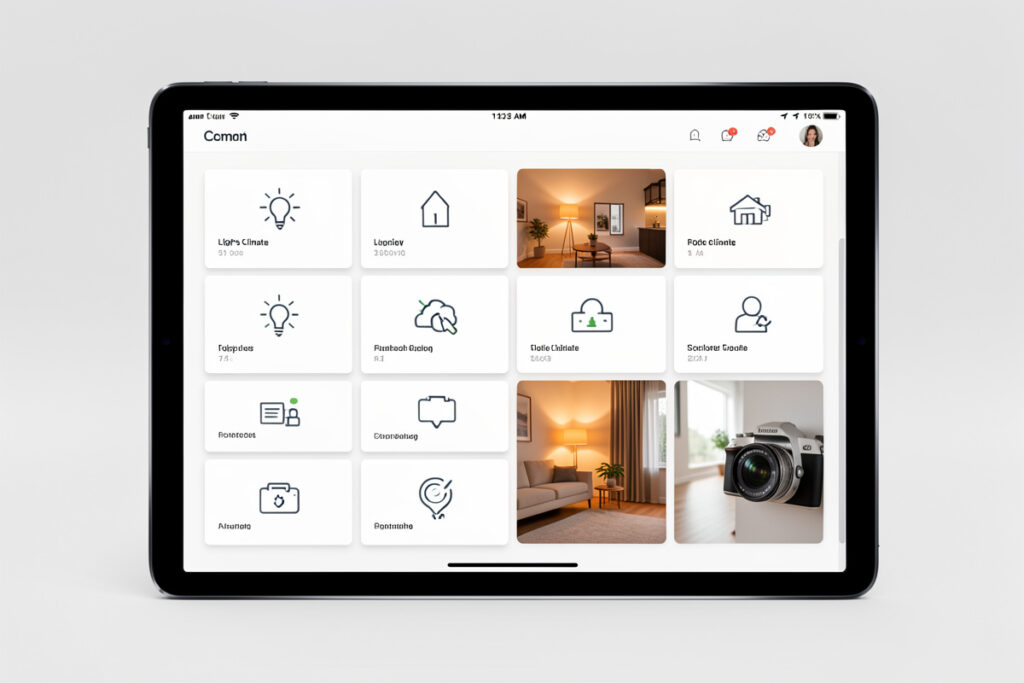
After years of rebuilding dashboards, I keep coming back to the same short list of cards. On any given view in my setup you will find maybe six card types doing all the work — a Tile card for controls, an Entities card for dense lists, a Mushroom card where I want touch-friendly chunk, and a couple of specialists. The best Home Assistant dashboard cards are not the flashiest; they are the ones you stop noticing because they just work.
Below is the actual vocabulary I build with, why each earns its place, and where the tempting custom cards quietly cost you more than they give. This is a companion to my broader Home Assistant dashboard guide — that piece is about layout strategy; this one is about the specific bricks.
The Tile Card Is the New Default
If I could keep only one card, it would be the built-in Tile card. It shows one entity as a clean rectangle with an icon, a name, a state, and a tap action — and it handles lights, switches, climate, covers, and media without any fuss. It replaced most of what people used to install custom cards for. In my house every room view is mostly Tile cards laid out in a grid, sized so a thumb hits them easily.
What makes Tile the workhorse is that tap and hold do sensible things out of the box: tap toggles, hold opens the full more-info dialog. You get depth for free without designing a single pop-up. I only reach past Tile when I want a fundamentally different look, and even then Mushroom is usually the answer, not a heavyweight custom card.
The Entities Card for Everything Dense
The Entities card is the opposite of Tile: instead of one big touch target, it stacks many rows in a compact list. It is unbeatable for admin views, settings panels, and anywhere I want to see a lot of state at once without scrolling forever. My diagnostics dashboard — battery levels, firmware versions, last-seen timestamps — is almost entirely Entities cards, because there I want density, not big buttons.
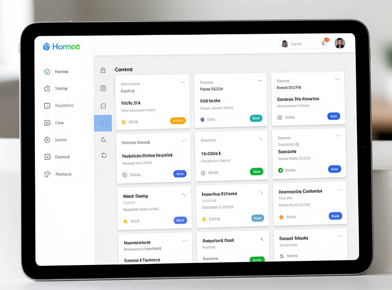
A trick I use constantly: an Entities card with a few different entities plus a header, as a mini-panel — “Front Door” with the lock, the contact sensor, and the porch light in one tidy block. It groups by meaning, not by device type, which is the whole philosophy of a good dashboard.
Mushroom Cards Where Touch Matters
When I want a dashboard that looks and feels genuinely modern on a wall tablet, I use Mushroom. The chunky sliders, the clean icons, the consistent spacing — it is the fastest route to a screen that looks designed rather than assembled. I do not use it everywhere, because Tile now covers a lot of the same ground, but on the main household dashboard the touch feel is worth the one HACS dependency. I wrote a full Mushroom cards setup guide for getting it clean quickly.
The honest tradeoff: Mushroom is a community card, so it is one more thing that can break on a Home Assistant update and one more thing to keep current. I accept exactly one or two custom card dependencies of that weight, and Mushroom earns its slot. Twenty custom cards do not.
The Specialists Worth Keeping
Beyond the big three, a handful of purpose-built cards handle jobs the generalists cannot. Here is how I choose between them:
| Card | Source | I use it for | Watch out for |
|---|---|---|---|
| Thermostat card | Built-in | Climate control with the dial UI | Takes real estate; one per view is plenty |
| Weather forecast card | Built-in | A glanceable forecast on the main view | Needs a weather integration set up first |
| History / mini-graph | Built-in / HACS | Temperature and energy trends | Heavy on the recorder; keep off the landing view |
| Button card | Built-in | Scene and script triggers | Easy to overuse; label clearly |
| Markdown card | Built-in | Templated text, custom status lines | Templating errors fail silently |
| auto-entities | HACS | Self-populating lists (all low batteries) | Depends on clean entity naming and labels |
The mini-graph card is the one I gate hardest. A trend line is lovely, but each one queries your history database when the view loads, and a landing page full of graphs feels sluggish. I keep graphs on a dedicated “trends” view that only loads when I open it, and the front page stays snappy.
auto-entities: The Card That Maintains Itself
My favorite advanced card is auto-entities, and it is worth the HACS install for one reason: it builds its own list from a rule instead of a hand-typed set of entities. I have a card that shows every device below 20% battery, anywhere in the house, across Zigbee, Z-Wave, and Wi-Fi. I never touch it. When a new sensor drops low it appears; when I swap the battery it vanishes. That only works because my entities are labeled consistently, which is exactly why I nag people to sort out areas, labels, and naming first.
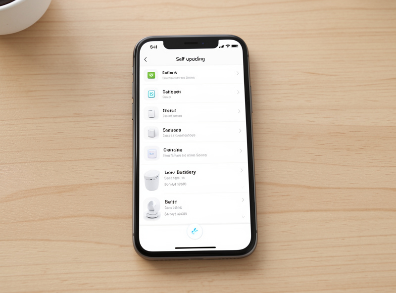
The same technique powers a “what is on right now” card, an “open windows” list, and an “unavailable devices” panel that tells me instantly when something has fallen off the mesh. These self-maintaining cards are the difference between a dashboard you constantly edit and one that keeps itself honest as the system grows.
Scenes and Buttons, Used Sparingly
The Button card is the one people overuse the moment they discover it. A grid of twelve buttons for every scene and script looks powerful and is miserable to actually use, because nobody remembers what “Evening 2” does. I keep buttons to the handful of scenes we trigger by hand — “movie,” “good night,” “everyone out” — and let automations fire the rest based on presence and time so there is nothing to press at all. A button you never need to touch is better than a button that looks impressive.
When I do use buttons, I make them unambiguous: a clear icon, a plain-language label, and a color that only lights up when that scene is active. The moment a control needs a mental lookup table, it has failed. The same discipline that keeps the phone dashboard usable applies here — surface the few things people actually do, and let the automations quietly handle everything else in the background.
Cards I Deliberately Avoid
Plenty of gorgeous custom cards exist, and I skip most of them. Anything that needs pixel-perfect manual configuration for every entity — I would rather spend that time on automations. Anything that duplicates a built-in card with slightly nicer styling — not worth the update risk. And anything that only renders correctly at one screen size, because I run the same system on a phone, a tablet, and a laptop. My filter is blunt: does this card do something the built-ins genuinely cannot, and will I still want it after the next three updates? If not, it does not go in.
Pair the right cards with conditional visibility and the dashboard gets calmer still — controls that appear only when they matter beat a static wall of buttons every time. Cards are the vocabulary; layout and conditions are the grammar.
Frequently Asked Questions
What is the best all-around Home Assistant dashboard card?
The built-in Tile card. It shows one entity as a clean touch target, handles lights, switches, climate, covers, and media, and gives you tap-to-toggle plus hold-for-details automatically. It replaced most of what people used custom cards for.
Do I need HACS custom cards for a good dashboard?
No. Built-in Tile, Entities, Thermostat, and Weather cards cover the vast majority of needs. HACS cards like Mushroom and auto-entities add real value, but keep the count low since each one is a dependency that can break on a Home Assistant update.
Why is my dashboard slow to load?
Usually history or graph cards on the landing view. Each one queries the recorder database when the page loads. Move trend graphs to a separate view that only opens on demand, and keep the front page to lightweight control cards.
What card shows all my low batteries in one place?
The auto-entities card from HACS. Give it a rule like state below 20 percent, and it builds a self-updating list across every protocol. It relies on consistent entity naming and labels, so organize those first.
Should I use Mushroom cards or Tile cards?
Use Tile as your default; it is built in and needs no maintenance. Add Mushroom when you want a chunkier, more touch-friendly look on a wall tablet. Many dashboards mix both, and that is fine.