Home Assistant Dashboard Guide: Design That Actually Works
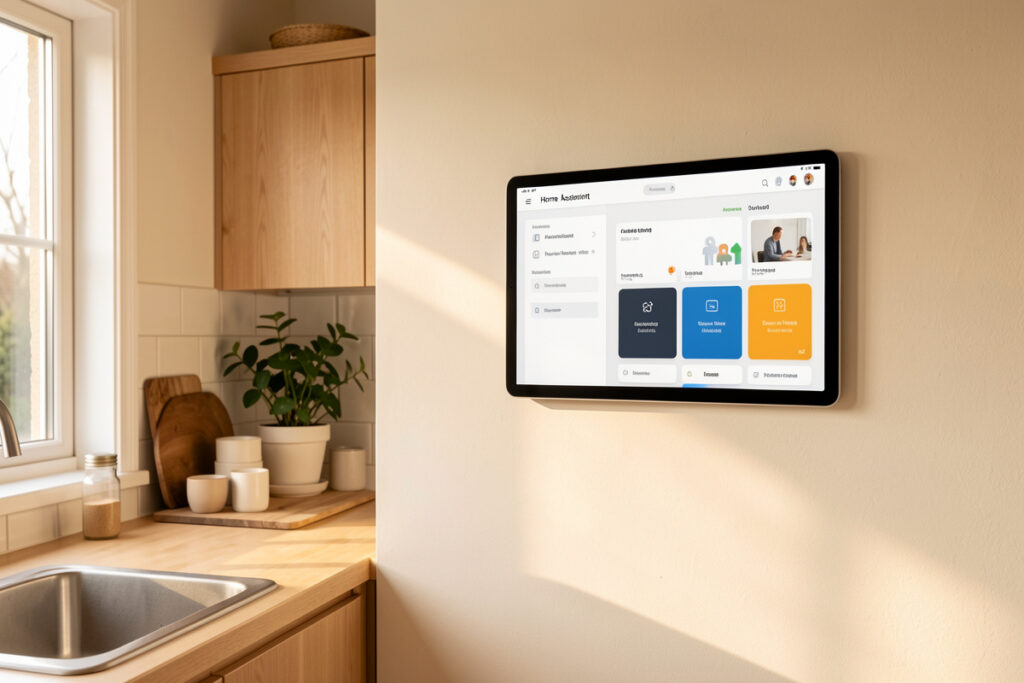
A good Home Assistant dashboard is a control surface you design around rooms and tasks, not a dump of every entity the system discovered. In my setup the test is simple: can someone who has never opened Home Assistant walk up, see what the house is doing, and change one thing in under three seconds? If yes, the dashboard works. If they have to scan a wall of toggles, it does not.
That standard sounds obvious, and almost every default dashboard fails it. Home Assistant auto-generates a view that lists everything, grouped by area, in whatever order the integrations loaded. It is a fantastic diagnostic screen and a terrible daily interface. This guide is the layout discipline I have built up across years of running a local-first hub — the card choices, the naming work, the multiple-dashboard strategy, and the maintenance habits that keep a dashboard usable as the entity count creeps past a few hundred. It is deliberately about design, not hardware; the wall tablet you mount it on is a separate decision I cover elsewhere.
What a Dashboard Actually Is in Home Assistant
In Home Assistant, the dashboard system is called Lovelace, and it has exactly three moving parts worth understanding: dashboards, views, and cards. A dashboard is the whole page (the URL). A view is a tab across the top. A card is a single block on a view — a light toggle, a sensor graph, a thermostat control. Everything you build is some arrangement of cards inside views inside dashboards.
Underneath the cards are entities: the individual states the hub tracks, like light.kitchen_ceiling or binary_sensor.front_door. A card does not create anything; it just points at one or more entities and decides how to draw them. This separation is the whole game. The same light.kitchen_ceiling entity can appear as a toggle on the phone view, a slider on the wall tablet, and a colored region on a floorplan — three cards, one entity, three contexts. Once that clicks, you stop thinking “where does this device go” and start thinking “which control does this task need, on this screen.”
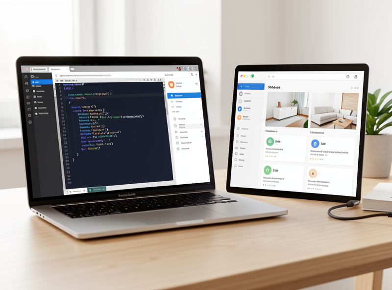
Home Assistant gives you two editors for this: the visual UI editor (drag, drop, fill in fields) and the raw YAML editor (edit the configuration text directly). The visual editor is faster for 80% of work. YAML is where you go when you want templating, conditional logic, or the custom cards the community builds. I run most views in YAML mode because copy-paste and search-replace across a big dashboard is far quicker than clicking, but there is no prize for suffering — build in the UI until it fights you.
The Mindset Shift: Design Around Rooms and Tasks
The single change that fixed my dashboards was to stop organizing by device type and start organizing by what a person standing in the house actually wants to do. Nobody thinks “I need to operate a Zigbee dimmer group.” They think “it is too bright in the living room.” Your dashboard should answer the second sentence.
In practice that means a view per room or per zone, and inside each view the three or four controls that room genuinely uses — lights, climate, maybe a media player and a couple of sensor readouts — placed in the order of how often they get touched. The rarely-used stuff (firmware versions, battery levels, the diagnostic sensors) goes on a separate admin dashboard that guests never see. A dashboard is an editorial decision: you are choosing what to leave out. The default view leaves nothing out, which is why it is useless as a daily driver.
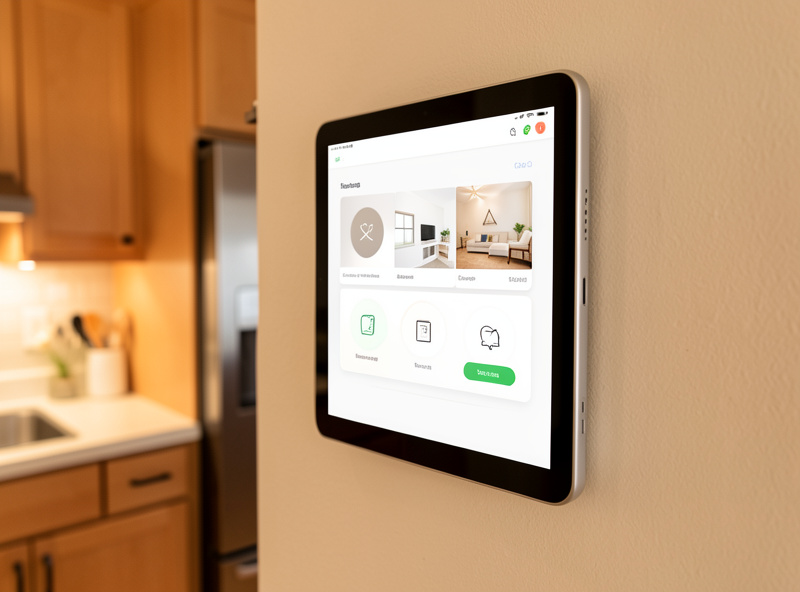
I also design for the person, not the enthusiast. My daily driver dashboard has no graphs on the front page, because nobody in the house wakes up wanting a humidity trend line. The graphs live one tap deeper for when I actually want them. Bury depth, surface frequency — that is the rule that survives contact with real people using the house.
Choosing Your Card Vocabulary
Home Assistant ships with a solid set of built-in cards, and the community adds a huge library on top through HACS (the Home Assistant Community Store). You do not need most of them. The trap is installing twenty custom cards and building a dashboard that only you can maintain. I keep a small, deliberate vocabulary — a handful of cards I reach for on every view — and I cover exactly which ones and why in my guide to the dashboard cards I keep on every view.
Here is how the main options compare in day-to-day use:
| Card type | Source | Best for | Maintenance cost |
|---|---|---|---|
| Entities card | Built-in | Dense lists, admin views, settings | Very low |
| Tile card | Built-in | Modern touch controls, one entity each | Low |
| Mushroom cards | HACS | Clean, chunky, touch-first layouts | Low once installed |
| Picture-elements card | Built-in | Floorplans, tap-a-region control | High (manual coordinates) |
| Conditional / auto-entities | Built-in / HACS | Cards that appear only when relevant | Medium |
My rule of thumb: reach for built-in Tile and Entities cards first, add Mushroom cards when you want a genuinely touch-friendly look fast, and only pull in the heavier custom cards when a specific view needs something the basics cannot do. Every HACS card is a dependency you have to keep updated; earn each one.
Organize the Entities Before You Build
The best dashboard work happens before you place a single card, in the entity settings. If your entities are named inconsistently — light.kitchen, Living Room Lamp, bedroom_light_2 — every card you build inherits that chaos, and auto-populating cards become impossible. Assigning entities to areas, tagging them with labels, and enforcing a naming convention is the unglamorous groundwork that makes everything downstream easy. I walk through the exact conventions I use in taming entities with areas, labels, and naming, and it is genuinely the highest-leverage hour you can spend.
Areas matter for dashboards specifically because modern Home Assistant can build a whole view from an area automatically. Assign every device to the right room, and the auto-generated area cards suddenly become useful instead of random. Labels go further: tag every battery device with a battery label and you can build a single card that lists every low battery in the house, no matter the room or protocol. That card maintains itself forever because it is driven by the label, not a hand-typed entity list.
Multiple Dashboards for Multiple Contexts
The biggest mistake I see is trying to make one dashboard serve every screen. A phone in your pocket, a tablet bolted to the kitchen wall, and a laptop browser are three completely different interaction models, and one layout cannot be right for all of them. In my house I run separate dashboards on purpose:
A phone-first dashboard is thumb-reachable, vertically scrolling, and shows the four or five things you actually check on the go — is the door locked, is anyone home, what is the house temperature. A floorplan dashboard is spatial: you tap the room on a map of your home instead of hunting through a list, which is the most intuitive layout there is for a wall-mounted screen. And a full-screen wall dashboard runs in kiosk mode so it shows only your interface — no browser bars, no Home Assistant sidebar, no way for a guest to wander into settings.
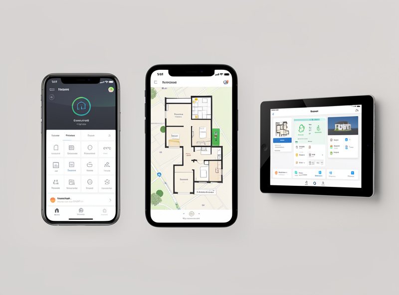
Home Assistant makes this cheap: you can have as many dashboards as you like, and you can restrict which users see which ones. My admin dashboard with all the diagnostic clutter is visible only to me; the household sees the clean room views. This is also how you keep the wall tablet safe — it points at one locked dashboard and literally cannot reach anything else.
Conditional Cards: Show Controls Only When They Matter
A dashboard that shows every possible control at all times is noisy. A dashboard that shows the garage-door warning only when the garage is open, or the “someone is at the door” card only when motion triggers at the porch, feels alive and stays calm the rest of the time. That is the job of conditional cards, and it is the difference between a screen you glance at and a screen you have to read.
I lean on this heavily: a “windows open” card that hides itself when everything is shut, a “laundry done” reminder that appears only after the washer finishes and clears when I acknowledge it, an “away mode” panel that swaps in when the house is empty. It keeps the everyday view uncluttered while surfacing exactly the thing that needs attention right now. The full technique, including the newer visibility conditions and the classic conditional card, is in my conditional cards walkthrough.
Building Your First Real View, Step by Step
If you are staring at the auto-generated mess and do not know where to start, here is the sequence I give everyone. It gets you from default clutter to a dashboard you actually use in an evening.
One: create a brand-new dashboard and leave the auto-generated one alone as a fallback. Settings, Dashboards, Add Dashboard, start empty. Two: add one view and name it after your most-used room — probably the kitchen or living room. Three: place only that room’s real controls: the lights, the thermostat, maybe a media player. Use a Tile or Mushroom card per control so each is big and tappable. Four: live with it for a few days. You will immediately notice the two things you keep wishing were there and the three you never touch. Five: adjust, then clone the pattern for the next room.
The reason this works is that it forces you to design from real use instead of from the device list. Every view earns its cards by observation. By the third room you will have a house style — a consistent card, a consistent layout, a consistent naming pattern — and the rest goes fast. Resist the urge to build all twelve rooms in one sitting from the entity list; that just recreates the default clutter with extra steps.
Badges, Headers, and Pop-Ups: The Details That Sell It
Three small features do a disproportionate amount of the work in making a dashboard feel finished. Badges are the little status pills across the top of a view — I use them for the handful of always-relevant facts: is anyone home, is the alarm set, what is the outdoor temperature. They are glanceable and take no vertical space. Headings and sections (the newer sections layout) let you group cards under labels like “Lighting” or “Climate” with proper spacing, which reads far better than a solid wall of tiles. And pop-up dialogs — tapping a tile to open a detail view instead of cramming every control onto the page — are how you get depth without clutter.
These are the difference between a dashboard that looks like a spreadsheet and one that looks designed. None of them require custom cards anymore; the built-in sections layout handles grouping, and the more-info dialog handles depth out of the box. I reach for the community’s pop-up tools only when I want a fully custom dialog, which is rare. Most of the polish is available in stock Home Assistant if you stop fighting the sections layout and let it group things for you.
My Layout Rules, After a Few Hundred Entities
These are the opinionated conventions I hold to on every dashboard I build, and they are what keep a big system legible:
One primary action per card. A card should have an obvious main thing it does. If I have to explain a card, it is doing too much. Consistent placement. Lights always top-left of a room view, climate top-right, sensors along the bottom — muscle memory beats cleverness. Color means state, not decoration. An entity glows when it is on; everything else stays neutral so the “on” things pop. Depth over width. I would rather tap once more than scroll a mile of cards, so I use views (tabs) and pop-up dialogs liberally instead of one endless page.
Design for failure, too. Because I run local-first, my dashboards keep working when the internet is down — the whole point of a self-hosted hub. But an entity can still go unavailable if a device drops off the mesh. A good card shows that honestly (greyed out, “unavailable”) rather than pretending the light is off. When a control lies about state, people stop trusting the whole dashboard.
Performance and Maintenance
A dashboard is code you have to live with, and it degrades if you ignore it. The two things that quietly wreck performance are heavy history graphs on the front page (each one queries the recorder database on load) and dozens of custom cards each pulling their own resources. Keep the landing view light, push graphs and detail to deeper views that only load when opened, and audit your HACS cards every few months — remove the ones you stopped using.
Version updates are the other thing that catches people. Home Assistant ships a release every month, and occasionally a dashboard feature changes — a card option gets renamed, a layout gains a new mode. Custom HACS cards are the fragile part: a core update can briefly break a community card until its author catches up. This is another argument for a small card vocabulary — the fewer third-party cards you depend on, the fewer things break on update day. When I update, I skim the release notes for anything touching Lovelace and keep the auto-generated fallback dashboard around so I always have a working interface even if a custom view throws an error.
The other maintenance reality is entity churn. Every time you add a device you create new entities, and if you do not immediately name and area them, they pile up as clutter that breaks your auto-populating cards. I treat naming as part of installing a device, not a someday task. Ten minutes at install time saves an afternoon of dashboard archaeology later — a pattern that shows up across my whole hub, the same rule engine that runs the grow lights and the sauna pre-heat only stays sane because everything gets named the moment it joins.
As an Amazon Associate I earn from qualifying purchases.
None of this requires the cloud, a subscription, or the “smart home of the future” the marketing promises. It requires deciding what matters, naming your entities, and choosing a small vocabulary of cards you can maintain. Do that and the dashboard stops being a chore you tolerate and becomes the calm control surface that makes the whole local-first setup worth running.
Frequently Asked Questions
Do I need to know YAML to build a good Home Assistant dashboard?
No. The visual editor handles most dashboard work by dragging and dropping cards. You only need YAML for advanced tricks like templating, conditional logic, or custom HACS cards. Build in the UI until it limits you, then learn just the YAML you need.
How many dashboards should I have in Home Assistant?
Most homes want three: a phone-first dashboard for on the go, a wall-tablet or floorplan dashboard for the house, and an admin dashboard with all the diagnostic clutter that only you see. One dashboard cannot serve a phone and a wall tablet well because the interaction models differ.
What are Mushroom cards and do I need them?
Mushroom is a popular HACS card collection that produces clean, chunky, touch-friendly controls with very little configuration. You do not need them, but they are the fastest way to a good-looking dashboard. Built-in Tile cards cover much of the same ground now.
Why does my default Home Assistant dashboard look so cluttered?
The default dashboard auto-lists every entity every integration discovered, in load order. It is a diagnostic screen, not a daily interface. Build your own dashboards organized by room and task, and hide the diagnostic entities on a separate admin view.
Can a Home Assistant dashboard work without the internet?
Yes. On a local-first, self-hosted hub the dashboard runs entirely on your local network, so it keeps working when the internet is down. Only cloud-dependent devices go unavailable; everything local, including the interface itself, stays responsive.
Should I organize my dashboard by device type or by room?
By room and task. People think in terms of what they want to do in a space, not in terms of protocols or device categories. A view per room with that room’s few real controls beats a giant grid sorted by device type every time.
Related Guides
- Best Home Assistant Dashboard Cards: The Ones I Keep on Every View
- Mushroom Cards Setup: A Clean, Touch-Friendly Dashboard Fast
- Home Assistant Kiosk Mode: Lock a Tablet to One Dashboard
- Conditional Cards: Show Controls Only When They Matter
- Building a Floorplan Dashboard: Tap the Room, Not a List
- A Phone-First Home Assistant Dashboard That Doesn’t Fight You
- Areas, Labels, and Naming: Taming Entities Before They Tame You
- Home Assistant Automation Examples: A Local-First Rule Engine
- Best Wall-Mounted Tablet for a Smart Home Dashboard